Let’s look back together at the history of Biancoflash, analysing how the logos and swatch book covers have developed. The range has also changed over the decades. Read on to discover all the stories and discoveries we have made in our historical archives!
A historical introduction
Biancoflash is a flagship brand of Favini that has its roots back in the 1960s, when some new equipment was introduced to the company. Its creation was inspired by the experience of Marco Favini, the CEO at the time, at Procter & Gamble, a major company in household cleaning and personal care products sector.
Initially, Favini had only three brands to the market: Cedro, Larius and Super Candore. Then there was Superbianco, a product sold in limited quantities, but which stood out for a high degree of whiteness. It was from this paper that Biancoflash came to life, thanks to the input of Lino Veronesi, Technical Director, and Giuseppe Boglini, Production Manager, who adapted the level of whiteness and smoothness.
After a communication and product design process, Biancoflash was launched during the Grafitalia trade fair. Over the years, it gained an established position in the market, particularly in 1974, which was a time of great demand.
How has Biancoflash’s branding and sampling changed over the years?
The offer has expanded over the years, with the addition of new range lines and in response to the changes within print technologies and different end uses.
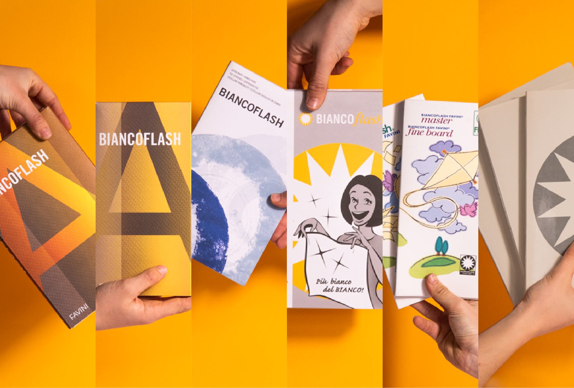
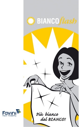
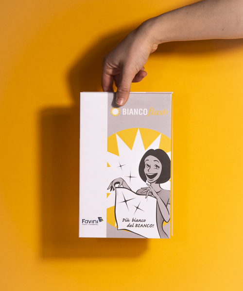
From the earliest samples from our archive, the basic communication elements for this paper were pure white, a smooth surface and the correct degree of ink absorption. In the 2000s, the agency Future Brand repositioned the brand in an incisive manner, devising a slogan to emphasise the degree of whiteness of the then new Premium version: “Più bianco del bianco – Whiter than white”.
The first logos in our archive include the photography flash symbol, a strategy to make the brand memorable and to emphasise the key feature of the product: A surprisingly dazzling white. The brand would later become more minimalist, losing the figurative elements and changing the font in favour of more linear, bold and clean tone, an expression of the qualities of the paper itself.
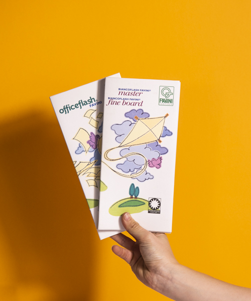
The sample books used to present Biancoflash to the market have also evolved: From colour illustrations contrasting with the white background, to emphasise the shade, to the iconic image developed by Future Brand reminiscent of an old-fashioned laundry detergent advertising. On the cover we find a housewife enthusiastic about her white sheet, as if it were freshly washed laundry. Even the slogan echoes the world of laundry detergents.
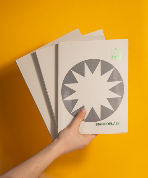
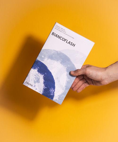
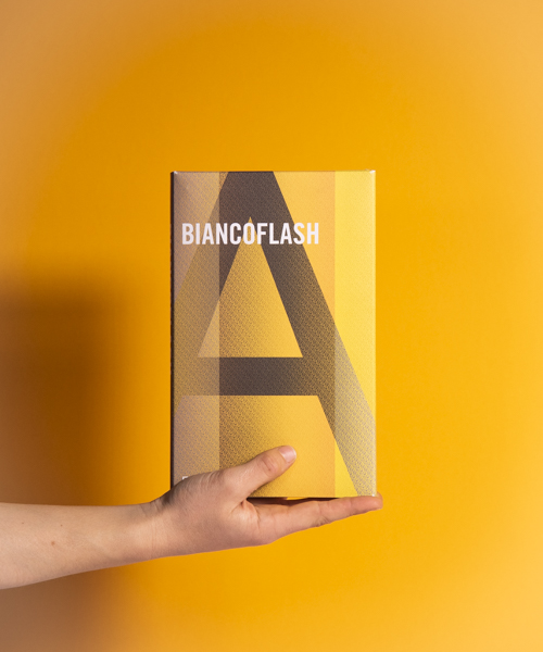
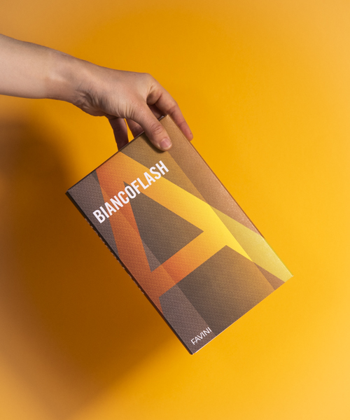
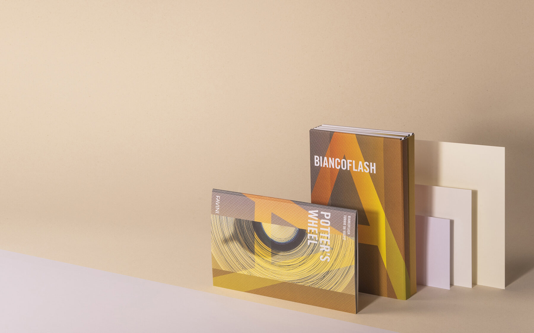
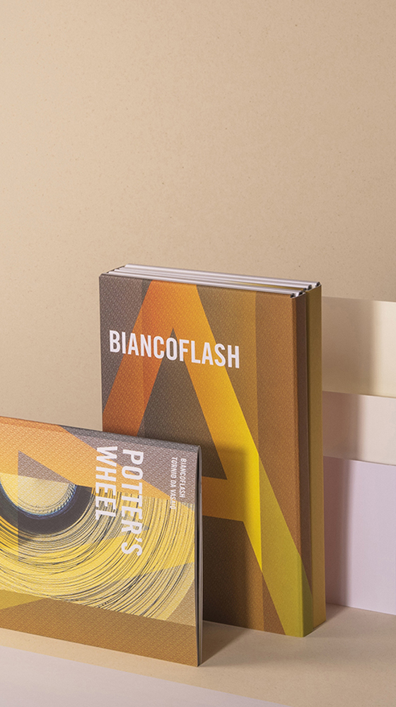
With the introduction of a new brand identity in 2009, the style of the sample books changed, and the covers displayed images of stamp printed objects. In the case of Biancoflash, these objects are music records, and the predominant shade is light blue. Most recently there has been a return to yellow, again with a change in style of the cover and there is an interplay with textures created by the superimposition of oversized letters that make up the FAVINI brand. The cover is now printed on Biancoflash Premium with full ink coverage, bringing out the full print potential of this paper.
Biancoflash range development
Biancoflash is synonymous with high-end white paper, and with this comes choices of various shades of white, different finishes, grammages and sizes.
In the early days, the strategy was to meet the needs of multiple print techniques, including office printers to which the Officeflash line was dedicated. The original colour is now known as Master, the original pure white with a classic smoothness.
In 2006, Premium, a brighter paper with excellent smoothness, made its appearance in the swatch books. Its creation was to meet the needs of export markets, in particular the Nordic countries that asked for bluer shades in white paper, as Andrea Favini, Export Sales and Marketing Director of Favini, explains.
Also, in response to market needs, including from Latin American countries, Biancoflash Ivory was created in the same years. In this way, the historic brand was extended and covered applications in the fine papers sector.
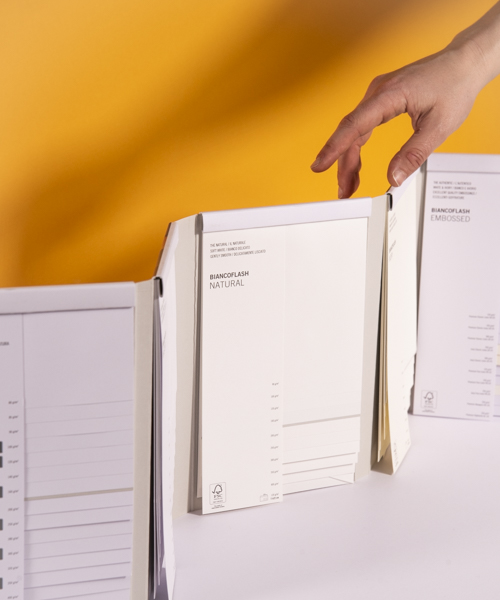
In the 2017 swatch book, the Embossed range appeared with new embossed versions, responding to overseas demand and including applications from the hotel and packaging sectors.
Finally, Natural was introduced in 2019, with a more delicate shade of white, to meet the revival of the preference from a segment of the market that likes an elegant and natural style.
Today, explains Andrea Favini, the export market has a preference for Biancoflash Premium, but there is a need to differentiate customers and end applications. Biancoflash Master is mostly bought by converters who make clothing boxes and tags. The Premium and Embossed versions are preferred in the production of invitations, brochures, and packaging.
Positioning and future prospects of the Biancoflash brand
Favini has marketed the Biancoflash brand for over fifty years. It has been appreciated by the market from the very beginning for its high quality, high print and finishing performance and, of course, the whiteness along with excellent smoothness.
This success has made it possible to invest in the range by taking quality to the highest level and expanding the assortment to cover diversified needs and preferences.
A development to the range can be advanced when the market expresses a greater preference for smooth papers, says Michele Posocco, Marketing Manager. Just now, adds Andrea Favini, current developments are reflecting the demand for new embossed versions.
Applications
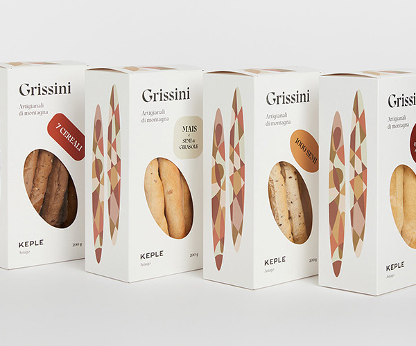
Thanks to its depth of range, Biancoflash meets the most diverse requirements. Customers appreciate its versatility coupled with its high quality: For high-value printed products, Biancoflash proves to be an irreplaceable ally for printers grappling with brochures, clothing tags, packaging, invitations and a host of other applications.
“The key feature of Biancoflash is its extraordinary printability. . It is a paper that does not allow the ink to penetrate too much and vice versa. The result is sharp, full images.”
— Emilio Marchiorello, Graphics Manager
Testimony: Biancoflash for Filippo Dalla Villa
‘’Biancoflash, the optical white of this paper has always intrigued me. Simple and clean, like its ease of use and versatility. In the past as today, I use this paper in the highest grammages for the business cards of Freskiz Comunicate, the studio I founded in 2004.
Over the years, it has remained a timeless and limitless paper for me. We have used it for so many projects: corporate guidelines, editorial projects, packaging, but also as a simple postcard, or as an event sign.
Varying the technique, I still like the idea of ‘placing’ on its surface, projects that make it visible, little text, as few iconographic elements, perhaps a few photographs, so as to enhance it to the fullest.
“I believe it is a ‘without’ paper, because every designer can decide to define it“
— Filippo Dalla Villa, Freskiz Communicate
In almost 20 years of application to projects, it has been the ‘corporate’ paper for us in the medical field and in the non-profit sector. In the first instance, because it was the paper with a natural feel that was the right match for the corporate identity for the entire EMEA market, of a leading pharmaceutical company. While in the second case, it was and still is the paper used to print all the materials of a small non-profit organisation, active in supporting children and young people locally. It is particularly used in combination with its cousin range of Burano (also a sister to me), where we create 3-colour harmonies, and the white of Biancoflash gives excellent reading to images in both colour as well as black and white.
I believe it is a ‘without’ paper, because every designer can decide to define it. Ask your printer, often using such an apparently easy paper becomes complicated. But “good design” is always born by several hands, so with the right support and a lot of sharing, you will succeed in making it ideal for your project”.
Potter’s wheel: The Biancoflash visual book
Intro
Biancoflash is a historical trademark of Favini, a high quality pure white paper. It is available in different finishes and embosses, making it versatile for many applications and fine print. One important feature is its printability: The ink does not penetrate making the print lose definition, nor does it remain on the surface giving an overly bright effect.
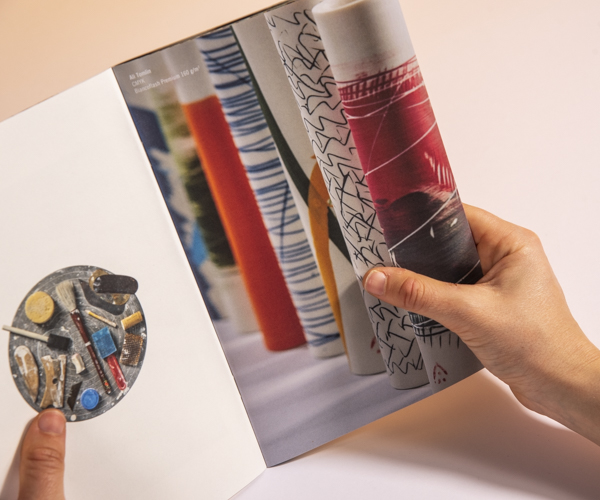
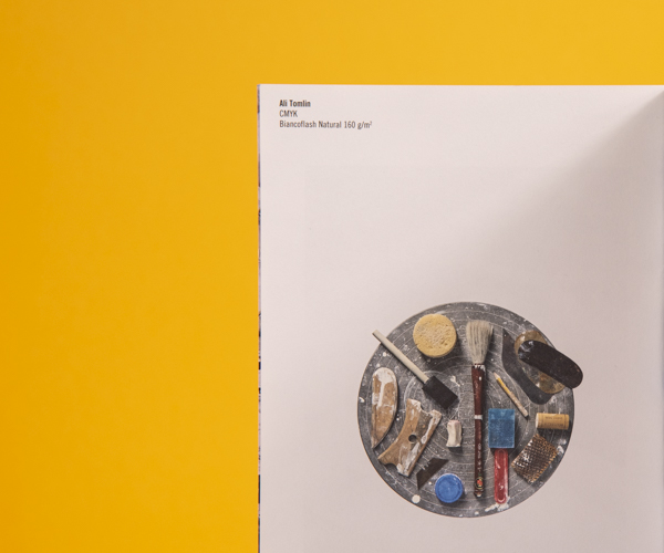
Potter’s wheel is the title of Biancoflash’s visual book. With this publishing project we wanted to show Favini’s most calendered paper. A white paper with a high degree of gloss and great printability.
The concept phase
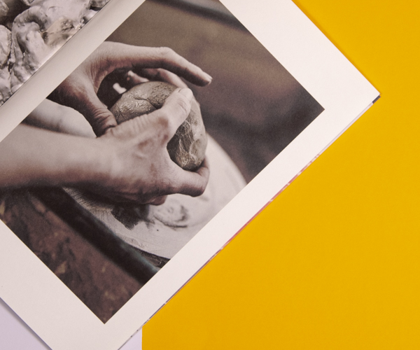
In the visual book, Biancoflash’s higher quality printing characteristic is compared to the quality and great value of a ceramic work of art.
Just as the artwork represents a unique and prestigious piece, so too print and application using Biancoflash take on value.
The production phase: A chiaroscuro tale of printed images
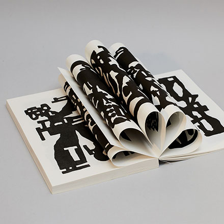
On a tactile level, browsing through the images you feel the smooth and pleasantly velvety surface of the paper. This is same surface that allows a very sharp and brilliant rendering of the images.
The visuals alternate between four-colour print on the different shades and ranges of Biancoflash available on the market today: Premium, Master, Natural, Ivory and Embossed. Even when using these different shades of ivory and white on the pages, the chiaroscuro is consistent.
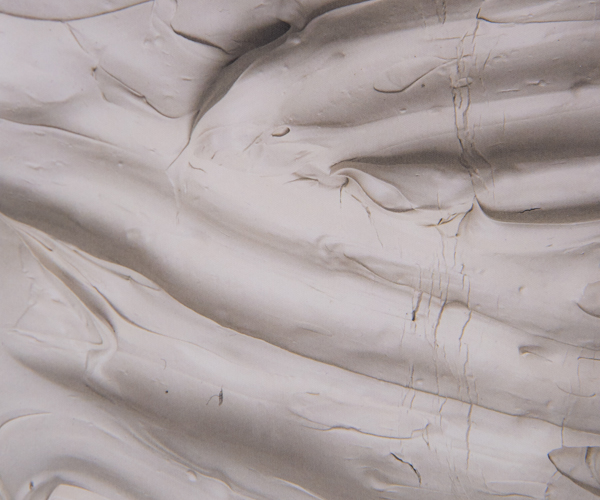
The image on the cover is sharp and deep thanks to a pleasant effect of chiaroscuro, made even more interesting by the embossing on the paper that brings to mind the materiality of the clay.
The great printability and the three-dimensional effect makes it possible to notice every detail of the image, from the texture of the clay to the cracks formed in it. The sepia-toned image remains brilliant and maintains quality.
Image definition is maintained throughout the visual, colours are full, and the details are sharp.
Conclusions
Just as the ceramic artefact represents a work of art, Biancoflash is the ideal Favini paper for brochures and fine publishing. Are you too ready to experiment?
What is Biancoflash
Looking for the ideal white paper for your project? Biancoflash is the Italian word for whiteness and quality and the name for our original brand of calendered paper. It’s available in four shades and four embossed styles.
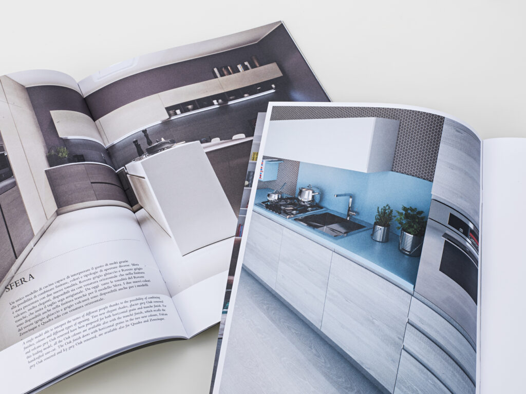
Biancoflash is the support chosen by designers, companies and printers as it is ideal as paper for catalogues and for numerous uses in the field of design, thanks to its excellent printability. Also available for digital printing.
Biancoflash is FSC™FSC™ C001810 certified.
Technical infoDownload chart
Biancoflash brand evolution
Discover morePrint results on Biancoflash: Potter’s wheel
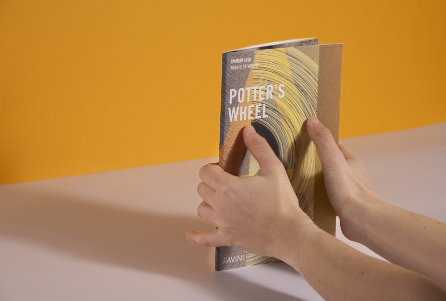
Potter’s wheel: The Biancoflash visual book
Discover more- Alga Carta
- Aralda
- Astralux
- Biancoflash
- Bindakote
- Burano
- Classy Covers
- Contact Laid
- Contact Pack
- Cover Line
- Crush
- Digital
- Dolce Vita
- Favini Art
- Laguna
- Lightset
- Lunar
- Majestic
- Mirage
- Prisma
- Refit
- Remake
- Sahara
- Shiro Echo
- Softy
- Sumo
- The Tube
- Tokyo
- Tree Free
- Twill
- Twist