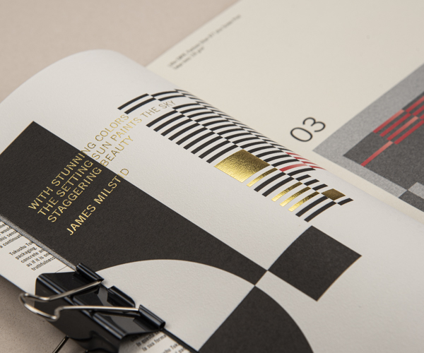
The constant research for innovation and the desire to experiment has inspired Favini beyond its own borders to create a new paper in collaboration with the Japanese Tokushu Tokai Paper mill. The union between two cultures and two countries has revealed new connections to explore. The meeting between the characteristic Italian aesthetic style and for a proficiency that is aligned towards Japanese perfection, has given rise to a new product: Tokyo.
Tokyo is the result of the union of the expertise of Favini and Tokushu Tokai Paper

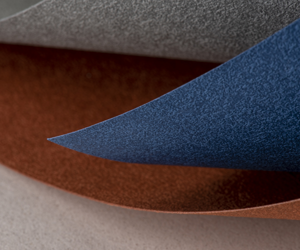
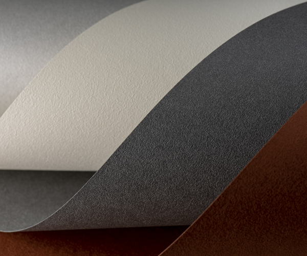
Tokyo is a high quality embossed paper and the range consists of seven colours: White, Ivory, Light Grey, Dark Grey, Black, Indigo, Rust. It is available in 120 gsm, embossed on one side only, and 350 gsm, embossed on both sides.
Not forgetting its ecological aspect which is also assured! Tokyo is FSC™ certified and contains 40% post-consumer recycled fibres.
Embossing and colours
The exclusive embossing makes this paper unique: This surface design is intended to catch the eye through the interplay of light and colour, created by a three-dimensional texture considered in terms of density, shape and effect.
But it is with the touch that the embossing succeeds in making the imagination travel! Tokyo leads us to an urban setting with a texture reminiscent of concrete, the naturalness of stone and the strength of rust.
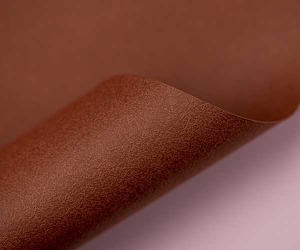
Tokyo is a sophisticated paper dedicated to luxury packaging and fine publishing.
The visual book
The Japanese tradition of perfection, organisation and detail combined with the modernity of their cities represents the mood that inspired the visual book. A project that testifies the print performance of paper.
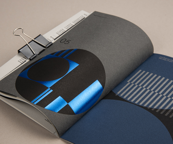
The visual book is inspired by the architectural movement of Metabolism from the 1960s. Its concept was to create buildings that would adapt to the ever-changing needs of the citizens of the new megacities that were forming.
This metabolically engineered architecture is adaptable, built around a backbone-like infrastructure with prefabricated and replaceable cells that are easily added and removed.
Whilst as an architectural movement it never took off, it did instead take root in the future of Japanese society, changing its form and altered future social systems.
Japan has historically placed a high value on mobility and resilience, fostering the development of a fluid society.
On the inner pages is the lettering of the name Tokyo which was developed in a graphical way to bring to mind in an abstract way the metabolic buildings. Shapes recalling architecture and living cells are enclosed within the lines of the letters.
The letters are then conjoined with small poems typical of the Haikus tradition.
The short and pending sentences summon up the evolution, interaction and fluidity of society and can be completed by the reader.
